


RFTO (Ready For Take Off)
Client: RFTO
Industry: Kids Fashion & Lifestyle
Scope of Work: Branding
Project Overview
RFTO is a children’s apparel brand inspired by the spirit of aviation, adventure, and imagination. Designed for young explorers, the brand aims to encourage children to dream big, discover new possibilities, and embrace their adventurous nature through thoughtfully designed pilot-inspired clothing.
Our objective was to create a distinctive brand identity that captures the excitement of flight while remaining approachable, playful, and memorable for both children and parents. The project focused on building a scalable visual system that could support future product collections, packaging, and brand communications.
- Brand Strategy
The brand strategy was built around the idea that every child has the potential to dream, explore, and reach new heights.
Inspired by the mindset of pilots and adventurers, RFTO was positioned as more than a clothing brand—it represents confidence, curiosity, and the courage to pursue one’s imagination. - Brand Positioning
- Aviation-inspired apparel for young dreamers and future explorers.
- Brand Personality
- Adventurous
- Brave
- Playful
- Energetic
- Inspirational
- Target Audience
-
- Children aged 3–12 years old
- Parents seeking meaningful and story-driven fashion brands
- Families who value creativity, exploration, and learning
Brand Identity Development
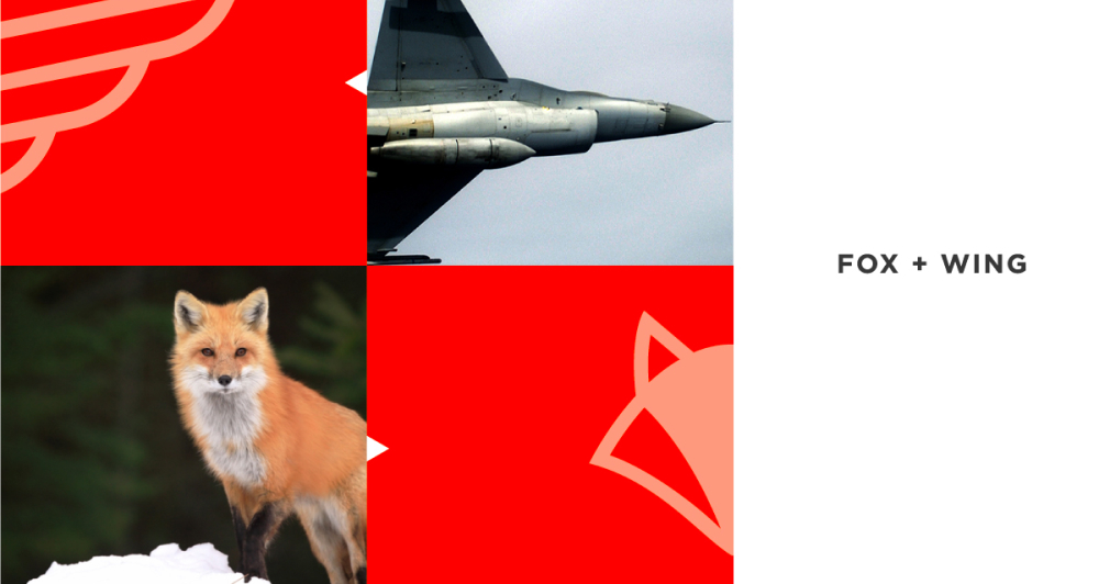
The brand identity was developed around the concept of “Fox + Wing.”
The fox symbolizes intelligence, agility, curiosity, and adaptability, while the wings represent freedom, aspiration, and exploration. Combining these two elements created a unique visual symbol that reflects the adventurous spirit of the brand.
This concept allowed RFTO to establish a distinctive identity that stands apart from traditional children’s fashion brands while creating an emotional connection with its audience.
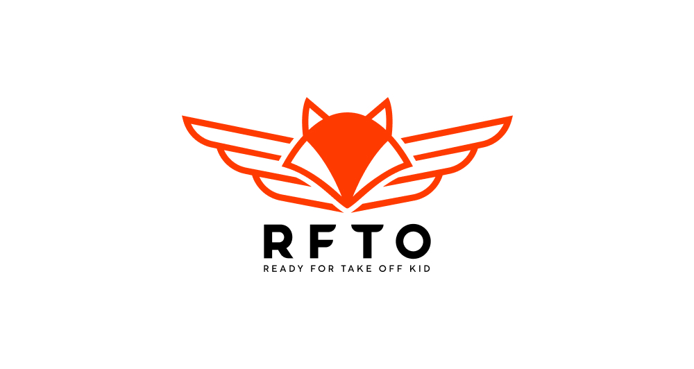
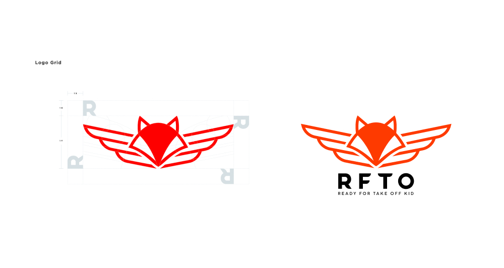
Logo Design System
The logo system was designed to be simple, memorable, and highly adaptable across various applications.
The primary mark combines the silhouette of a fox with aviation-inspired wings, creating a symbol that represents both imagination and adventure.
The system includes:
- Primary Logo
- Secondary Logo
- Icon Mark
- Monochrome Version
- Responsive Logo Variations
The clean geometric structure ensures consistency and recognizability across digital and physical touchpoints.
Visual Identity
The visual identity draws inspiration from aviation equipment, flight uniforms, aircraft markings, and military flight aesthetics.
Color Palette
The brand color system consists of:
- Aviation Orange
- Deep Black
- Military Green
- Off White
The bold orange creates strong visual recognition and conveys energy, excitement, and confidence, while darker tones provide balance and authenticity.
Typography
A modern and bold typographic system was selected to reinforce the brand’s adventurous and confident personality while maintaining excellent readability across all media.
Graphic Elements
Supporting visual elements include:
- Wing-inspired graphics
- Aviation badges and patches
- Directional flight lines
- Technical aviation-inspired layouts
- Custom brand patterns
Together, these elements create a cohesive and recognizable brand experience.
Brand Applications
The visual identity was applied across a variety of brand touchpoints to create a consistent and immersive customer experience.
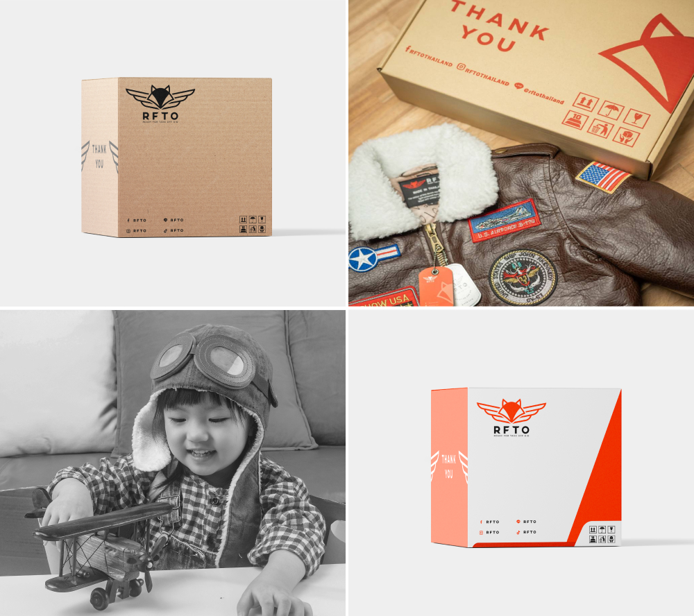
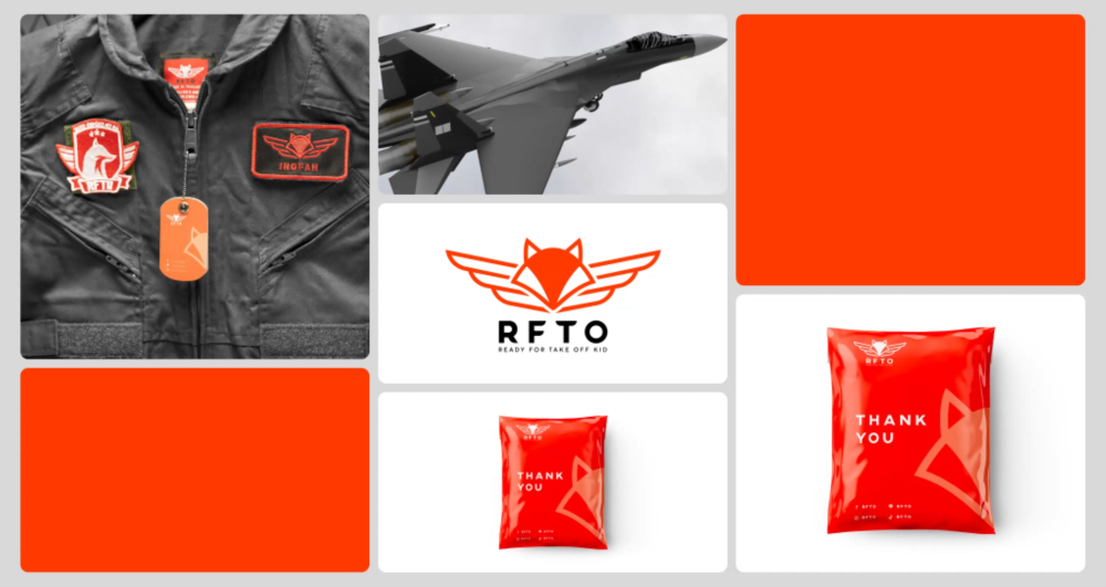
- Product Packaging
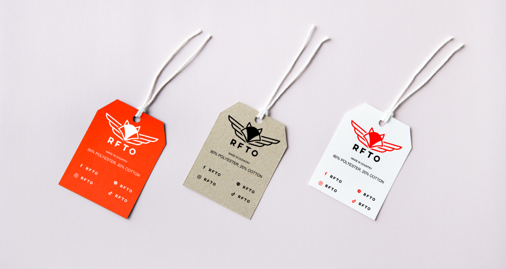
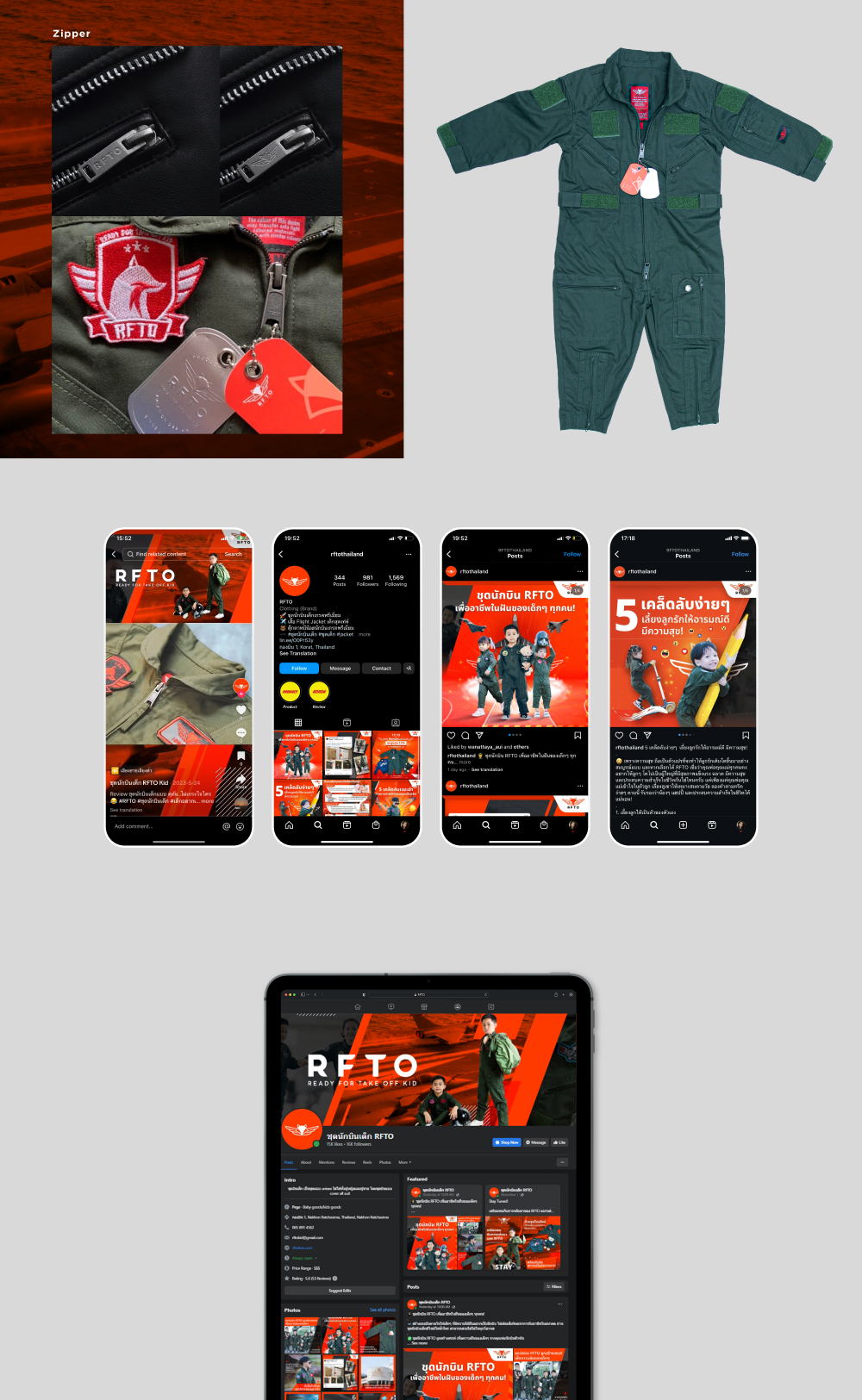
Custom packaging was designed to reflect the aviation theme while enhancing the unboxing experience for customers. - Hang Tags
The product tags were inspired by luggage tags and pilot identification labels, reinforcing the travel and exploration concept. - Embroidered Patches
A collection of aviation-inspired patches and badges was developed for apparel applications, creating an authentic pilot-inspired aesthetic. - Heat Transfer Graphics
Custom heat-transfer graphics and insignias were created to add character and storytelling elements to the garments. - Apparel Labels
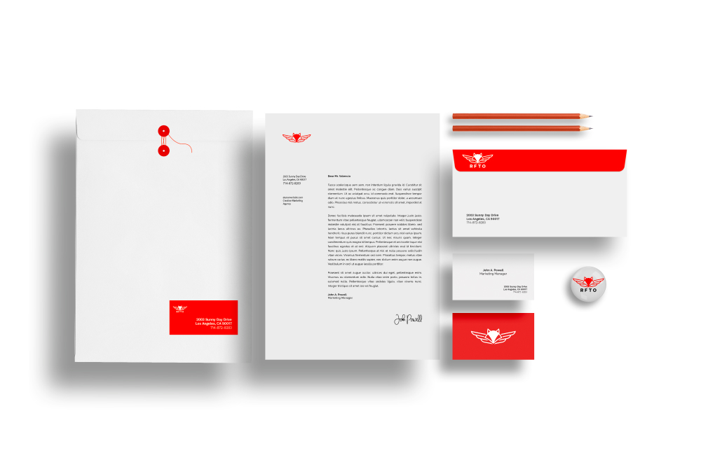
Branded neck labels, care labels, and size tags were designed to maintain consistency across all product lines. - Stationery & Brand Collateral
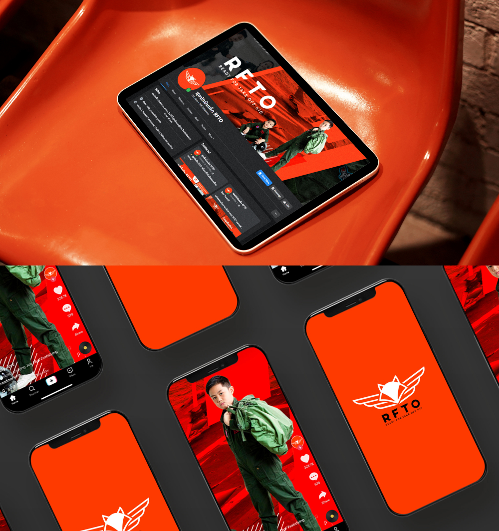
The identity system was extended to business stationery, packaging inserts, and promotional materials. - Social Media Assets
A digital content system was developed to ensure consistency across social media platforms and future marketing campaigns
Brand Guidelines
A comprehensive brand guideline was created to maintain consistency across all brand communications and applications.
The guideline covers:
- Logo Usage
- Color Specifications
- Typography System
- Graphic Elements
- Packaging Applications
- Apparel Branding
- Social Media Templates
- Brand Communication Principles
This framework ensures the brand remains cohesive and recognizable as it continues to grow.
Results
The branding project successfully established a strong and distinctive identity for RFTO.
Key outcomes include:
- A memorable and recognizable brand identity
- A unique positioning within the children’s apparel market
- A scalable visual system for future growth
- Consistent brand applications across products and packaging
- Increased professionalism and brand credibility
- A strong foundation for future marketing and product development
Final Thoughts
RFTO demonstrates how strategic branding can transform a simple apparel concept into a meaningful and engaging brand experience.
BY COMBINING THE ADVENTUROUS SPIRIT OF AVIATION WITH THE IMAGINATION OF CHILDHOOD, WE CREATED A VISUAL IDENTITY THAT INSPIRES YOUNG EXPLORERS WHILE BUILDING A STRONG AND SCALABLE FOUNDATION FOR THE BRAND’S FUTURE GROWTH.
We specialize in building brand identities for lifestyle, fashion, and product brands that blend meaningful storytelling, distinctive visuals, and systems that scale — all designed to make your brand unforgettable from day one.