


Long Fei 唐人仔
Client
PROJECT OVERVIEW
Lhong Fei (唐人仔) is a food and beverage brand inspired by contemporary Asian culture, blending traditional Chinese influences with a warm and modern lifestyle experience. The brand required a comprehensive corporate identity system that would establish a distinctive and recognizable presence across both physical and digital touchpoints from in-store signage and packaging to stationery and marketing materials.
Allwork Studio was brought in to develop the full brand identity crafting a visual language that authentically reflects the brand’s cultural roots, warmth, and premium quality, while maintaining a clean and modern aesthetic suited to today’s competitive F&B market.
DESIGN GOAL
To create a memorable and cohesive brand identity that communicates Lhong Fei’s unique cultural character and contemporary lifestyle positioning strengthening brand recognition consistently across packaging, signage, stationery, and all customer touchpoints.
DESIGN APPROACH
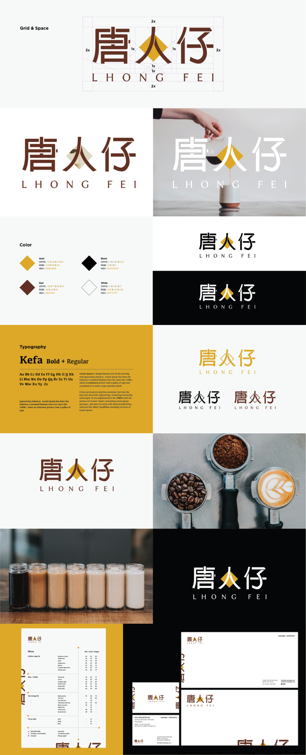
The identity system was developed by thoughtfully combining traditional Chinese-inspired elements with modern typography and minimalist design principles. The logo mark integrates cultural symbolism with a refined contemporary aesthetic creating a timeless visual mark that is both distinctive and highly versatile across applications.
A carefully curated color palette of warm gold, deep brown, black, and white was selected to evoke craftsmanship, authenticity, and premium quality colors that feel both culturally grounded and visually sophisticated. Kefa Bold + Regular was chosen as the primary typeface, supporting both Chinese and Latin characters with equal elegance and ensuring strong legibility across all brand applications.
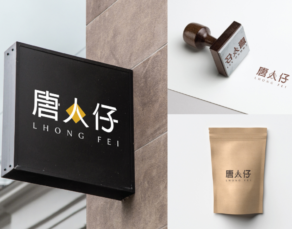
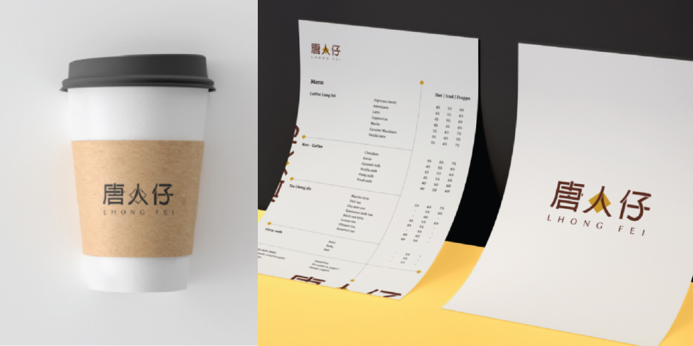
The grid and spacing system was established to ensure the logo mark maintains balance, clarity, and visual consistency at every scale. The identity was then extended across the full brand ecosystem menu design, stationery, business cards, cups, packaging, and signage creating a seamless and cohesive experience at every customer touchpoint.
KEY DELIVERABLES
- Logo Design & Brand Mark
- Grid & Spacing System
- Color Palette Development
- Typography System (Kefa Bold + Regular)
- Logo Usage Variations (Color, Monochrome, Reversed)
- Brand Guidelines
- Menu Design
- Stationery & Business Card Design
- Packaging Design (Cups, Pouches, Labels)
- Signage Applications
OUTCOME
The final identity system provides Lhong Fei with a strong, distinctive, and culturally resonant visual foundation that reflects the brand’s values and heritage. Through consistent application across every touchpoint — from the coffee cup in a customer’s hand to the signage above the door — the brand achieves a professional, warm, and memorable presence that sets it apart in the competitive F&B landscape.
FINAL THOUGHTS
Brand identity is more than a logo — it is the visual expression of a brand’s story, values, and personality.
“A STRONG BRAND IS BUILT THROUGH CONSISTENCY, CLARITY, AND MEANINGFUL DESIGN.”
By combining cultural inspiration with contemporary design principles, this project created a distinctive identity system that authentically represents Lhong Fei’s character and establishes a lasting connection with its customers — one cup, one experience at a time..